


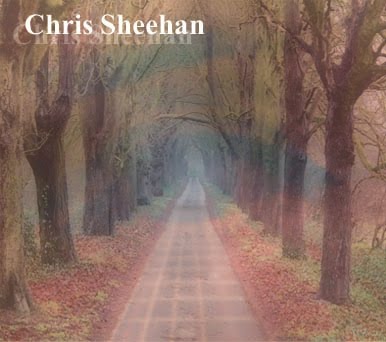

I started with an image that was included within my video. This once again creates the bridge between the music video and the CD cover.
I then took a photo of an acoustic guitar neck and added it faintly to the road. This creates the connection between the acoustic music and the artist. I also lowered the opacity because it causes the audience to look closely and realise what it is. This creates a more personal connection with the audience and they will feel attached to the product.
I then added the image of an eye that I have used several times within the music video. I made also made it faint to make the audience look closer at the images. It also gives the cover that slightly orange colour that is included within my video on several occasions. All these points make the artist instantly recognisable through the video and the CD cover.
I then added the artists name to the top left corner. I used a basic, but cursive font as I feel he is unique, but quite a traditional acoustic artist. I then added the second "Chris Sheehan" underneath and made it slightly faint. This makes it seem like a shadow and adds depth to the words.
I then used the same style of font to write the name of the album in the bottom right hand corner. The fact that I have included text at the top and the bottom makes the audience focus on the eye that is in the center. This allows them once again to make the connection between the cover and the music video.
0 comments:
Post a Comment