Making the website page

I began with this picture of an eye which I included within music video, thus creating a link between the products. I raised the contrast so that the eye stands out a lot more.


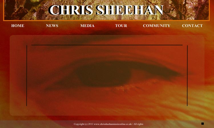
I added the 'Header' and placed it at the top of the page in the center.


I placed a border around the header to isolate it from the image of the eye. I used a slightly orange colour to match the colour of the skin behind it.

I then added the name of the artist to the header. I used the same font as the text off the CD cover. This creates a brand style and a title that is instantly recognisable to the audience.
I then placed a bar at the bottom of the screen. I made lowered the opacity of the bar so the image underneath is slightly visible. I also placed the copyright details on this bar as seen is most typical websites.

I then placed a rounded rectangle on to the middle of the screen and once again made it slightly translucent so the eye is still visible underneath.

I then placed some black lines in the rounded rectangle to create a border for the text that I will include. I also made sure they surrounded the eye so that it stands out and makes a visual impact on the audience.


I then added the links at the top that include 'Home', 'News', 'Media', 'Tour', 'Community' and 'Contact'. I used the same font as the CD and the logo to the house style.


I also slightly raised the contrast to make the image slightly more orange to once again match the other products.


I added some text to the main rounded rectangle that includes the latest information. I added a welcoming message, the post itself and the date and time of when it was posted.


Lastly, I added the buttons for a music player in the bottom right. It has a 'skip', 'pause' and 'stop' button.


I will explain all my decisions within the evaluation of my products.

Designing and Making the front cover of my Digi-pack


I started with an image that was included within my video. This once again creates the bridge between the music video and the CD cover.


I then took a photo of an acoustic guitar neck and added it faintly to the road. This creates the connection between the acoustic music and the artist. I also lowered the opacity because it causes the audience to look closely and realise what it is. This creates a more personal connection with the audience and they will feel attached to the product.

I then added the image of an eye that I have used several times within the music video. I made also made it faint to make the audience look closer at the images. It also gives the cover that slightly orange colour that is included within my video on several occasions. All these points make the artist instantly recognisable through the video and the CD cover.


I then added the artists name to the top left corner. I used a basic, but cursive font as I feel he is unique, but quite a traditional acoustic artist. I then added the second "Chris Sheehan" underneath and made it slightly faint. This makes it seem like a shadow and adds depth to the words.


I then used the same style of font to write the name of the album in the bottom right hand corner. The fact that I have included text at the top and the bottom makes the audience focus on the eye that is in the center. This allows them once again to make the connection between the cover and the music video.

Finding a copyright free picture of space

For my green screen dancing shot, I would like to find a picture of space to place behind them. I am hoping to find a copyright free picture of a nebula or of the stars. I think a colourful picture would suit the video more, so I will try and find one.


I have come across this picture:


I think this picture suits my video perfectly. It is a mass of different colours, lost within space so relates to the feeling of hopelessness that can be seen in the songs lyrics, but also connects to the feeling of hope that is provided as well.

The picture is also copy right free, which is extremely important as it is available to use for any purpose and is not illegal.

I wanted to include a picture of space as I wanted to relate to the lyrics in the song about "an asteroid belt". It causes the audience to realise how expansive human's emotions can be and adds a new depth to the meaning of the video.

Choice of font


The first font I looked at was 'Calibri'. I liked how simple it was, but did not like the curves found on each letter. It makes the font look too modern, and not one you would relate to an acoustic artist. I decided that I wanted to find a font that was simple, but had a lot more straight edges.


The second font I tested was 'Nyala'. It had more straight lines, but it still had many curves that still made it look slightly modern. I did not like the points found on the edge of each letter aswell. I dismissed the option almost immediately as I felt it deffinately did not represent the acoustic genre.


The third and final font was exactly what I was looking for. It was simple, had straight lines and even though there were still curves, they weren't exaggerated and were kept to a minimum. It is called 'Aparajita'. I thought it would fit the style of music Chris Sheehan plays as it is traditional in some aspects, but completely unique and original in other ways. It was also very clear to read which is essential on any product.

I will use this font throughout all of my products.


Mock CD cover 2


This is the second mock CD cover I have produced. I added a lens flare to the top left to make the image seem more vibrant. I used the same idea of layering images on top of each other to give the picture more depth. However, I decided that the image wasn't eye catching enough, so I decided to add contrast.


This is the image with a high contrast effect. I feel it makes the picture a lot more eye catching, but I think it is too bright. I do not think this brightness matches my video and I believe it needs to be darker. However, I like the use of two layers of font and making the lower layer black. This causes the words to stand out a lot more.


Mock CD cover

I believe the image underneath the font is good as the two images layered over each other looks effective. It also matches some of the shots I am using within my video. However, I don't think the font suits the artist as it seems too fancy and flamboyant. I do like the two layers of font as it causes the white words to stand out a lot more.

Analysis of acoustic album covers - Ideas that I can include


Please click the images to view a larger version


Ideas I have gathered from analysis:
  • Each of the examples I looked at within the acoustic genre featured an image involving nature and the environment. All three involved trees within the images. This makes the audience instantly recognise that they are of the acoustic genre, so this is a very effective technique I may use.
  • Each example uses a simple font for the text included on the cover. I think this is effective as it shows that the acoustic genre is raw and simple.
  • Each uses natural colours such as green, yellow and brown. I will try to include these as much as i can within the three products I am making.

Location shots

This is the graveyard location for one of my shots. I chose it as the sun shines on some parts, while others are hidden in shadow, and I think this looks very effective.


I chose to use several shots of this road as it seems to never end. I thought this would be a good image to use to fit with the lyrics as it is as if no one can ever help, and so the road is endless.


These are pictures from the church at Clop Hill. I decided to use this abandoned church as the location for some of my shots as you can once again relate it to the song. The church was once great and beautiful, but now it is run down and isolated. The same idea can be seen in the lyrics as friendship is a great and powerful thing, but once you need help, friendship is lost and ruined.


This is the location I chose for the background of my 'Silhouette' green screen effect. I also plan to use it in both my ancillary tasks. I feel it is perfect as it once again relates to the meaning behind the lyrics and it is a very picturesque area.


The other shots within my video will feature nature and scenery similar to that seen in these pictures. I will also involve images of a hand writing certain lyrics and coins being spun.

Final storyboard


Changes to silhouette idea

I have decided to change the idea of black silhouette's on a white background, to two opaque white silhouette's layered on top of this picture. I have decided this because I would like to keep the theme of nature as continuous as possible. It will also flow a lot better with the rest of the video. I will achieve this effect by filming two people in front of my green screen, removing the green, changing the characters to an all white colour and then lowering their opacity. I think these shots will be extremely effective and meaningful.

Changes to my film

After visiting my location and testing some shots, I decided that this was not the right place to film. This was mainly because I wanted more in the background of the videos, so I had to find somewhere with more scenery.

I also decided that the direction of my video was not going to work with the song. I have decided that I will use images of two people (As well as imagery of nature + scenery). One of these people will seem to be better off and happier than the other. I want these to be black sillhouettes on a white background as I feel this will exaggerate the images and ideas more.

Time Lapse shot

Within my film, I am including a shooting technique called a Time Lapse. This is where the camera is left to film for a long time, and then during the editing process, I speed up the film so that it is a few seconds long.
I filmed the cornfields for two hours as the sun was setting. Once sped up, it looks as if the sky and the surroundings are darkening extremely quickly. This gives the effect of a lot of time passing.

Schedule for Music Video

Here is my new Film schedule:

November 15th 4:00pm - 7:00pm : Film time lapse shot
November 18th: Film green screen dancing
November 19th: Film green screen silhouettes
November 23rd: Visit Clop Hill and film shots there
November 25th: Film at fields near Aston for intro etc.
November 29th: Take photo for silhouette background
December 3rd: Film various other shots
December 6th: Film clips of coins spinning etc.
December 10th: Begin editing

Location Shots

Here are two images from the cornfields on which I want to film parts of my music video.

I feel this area will fit my video extremely well as it follows the theme of nature and is very picturesque.

I will shortly add more pictures to this post and explain in more depth why I have chosen it.

Chris Sheehan Images

Images of Chris Sheehan can be seen below. The guitar can be seen as an important part of his image as most of his songs include him singing and playing the guitar. I will incorporate the guitar theme into the branding of this artist as I feel it is extremely important.


As you can see, the images follow the colour schemes that I talked about within my previous post. This means that this is the style of image I will want to use within my artist branding.