Evaluation
Evaluation Sam Hammond media a2
View more presentations from hammonday.
Question 3 will be uploaded shortly


Problems producing the music video and how they were resolved
- Problem: Weather caused filming to be delayed Solution: Arranged another day to film, waited until conditions had returned to normal etc.
- Problem: Fitting editing etc. around other school work, revision, outside of school responsibilities Solution: Arranged specific times throughout the week that I would focus and work on the project
- Problem: Some shots turned out to be wrong and not like how I had planned Solution: Re-film, or Re-edit these shots and try to make them as close to how I had planned as possible
- Problem: When filming, I noticed some shots etc. were not going to work or suit the film Solution: Rethink the ideas and adjust the storyboard
- Problem: Most of the clips were different colours etc. Solution: Adjust the contrast, brightness and colour balance on Adobe Premiere to match them as closely as possible
- Problem: Some green screen videos did not have the correct lighting to use the chroma key tool correctly Solution: Re-film these clips using better lighting
Making the website page
 I began with this picture of an eye which I included within music video, thus creating a link between the products. I raised the contrast so that the eye stands out a lot more.


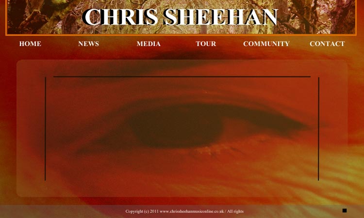


I added the 'Header' and placed it at the top of the page in the center.
I placed a border around the header to isolate it from the image of the eye. I used a slightly orange colour to match the colour of the skin behind it.
I then added the name of the artist to the header. I used the same font as the text off the CD cover. This creates a brand style and a title that is instantly recognisable to the audience.
I then placed a bar at the bottom of the screen. I made lowered the opacity of the bar so the image underneath is slightly visible. I also placed the copyright details on this bar as seen is most typical websites.
I then placed a rounded rectangle on to the middle of the screen and once again made it slightly translucent so the eye is still visible underneath.
I then placed some black lines in the rounded rectangle to create a border for the text that I will include. I also made sure they surrounded the eye so that it stands out and makes a visual impact on the audience.
I then added the links at the top that include 'Home', 'News', 'Media', 'Tour', 'Community' and 'Contact'. I used the same font as the CD and the logo to the house style.
I also slightly raised the contrast to make the image slightly more orange to once again match the other products.
I added some text to the main rounded rectangle that includes the latest information. I added a welcoming message, the post itself and the date and time of when it was posted.
Lastly, I added the buttons for a music player in the bottom right. It has a 'skip', 'pause' and 'stop' button.
I will explain all my decisions within the evaluation of my products.